Interact with my Special Someone
Spring 2016
Tablet Application
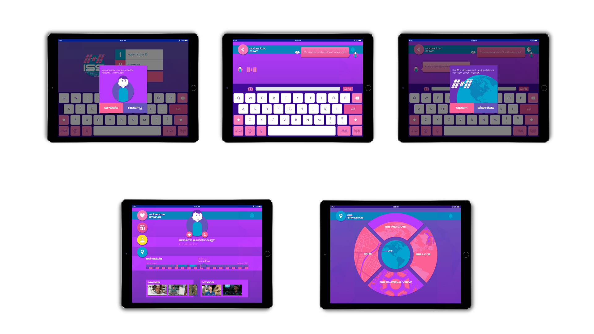
The goal for this project was to create 5 interactive animations for an app of any topic of our picking. My app ended up being about keeping friends and family connected with loved ones up on board the International Space Station. The app was in a constant state of flux for me, originally I wanted to make a augmented reality app for gear like the Hololense of Google Glass that covered everything in space (constellations, satellites, events, ect.) None-the-less I narrowed down the subject to the ISS because I was biting off more then I could chew. I ended up with 5 interaction for the ISS app: Login In, Receiving a Message, Getting a Notification, Changing Pages, and Viewing the Live ISS Feed.
First Concept Sketches

These are some of the first sketches I made for the project. I was so widespread, as far as space expanded was my direction, at least I got it all down so I could pick one section to focus in on. One neat bit of UI that was never used here is the VR hand map, where simply by opening and closing your hand you can zoom in and out of a map of the universe.
First Concept Assets
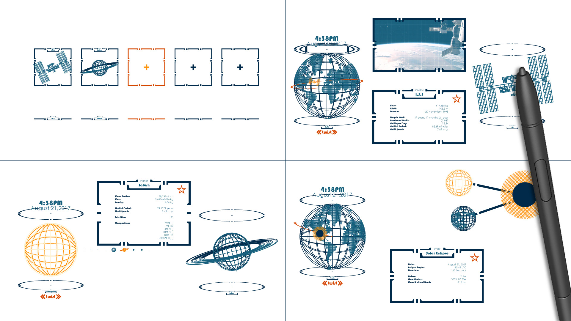
This is the last remnants of my old design direction for this project, the stereotypical smart tech, orange and blue, all wireframey, I just didn't stick with it because it has all been done. It looks cool, but it doesn't really say anything unique besides, 'hey look I'm like Tony Stark tech!'.
Sketches
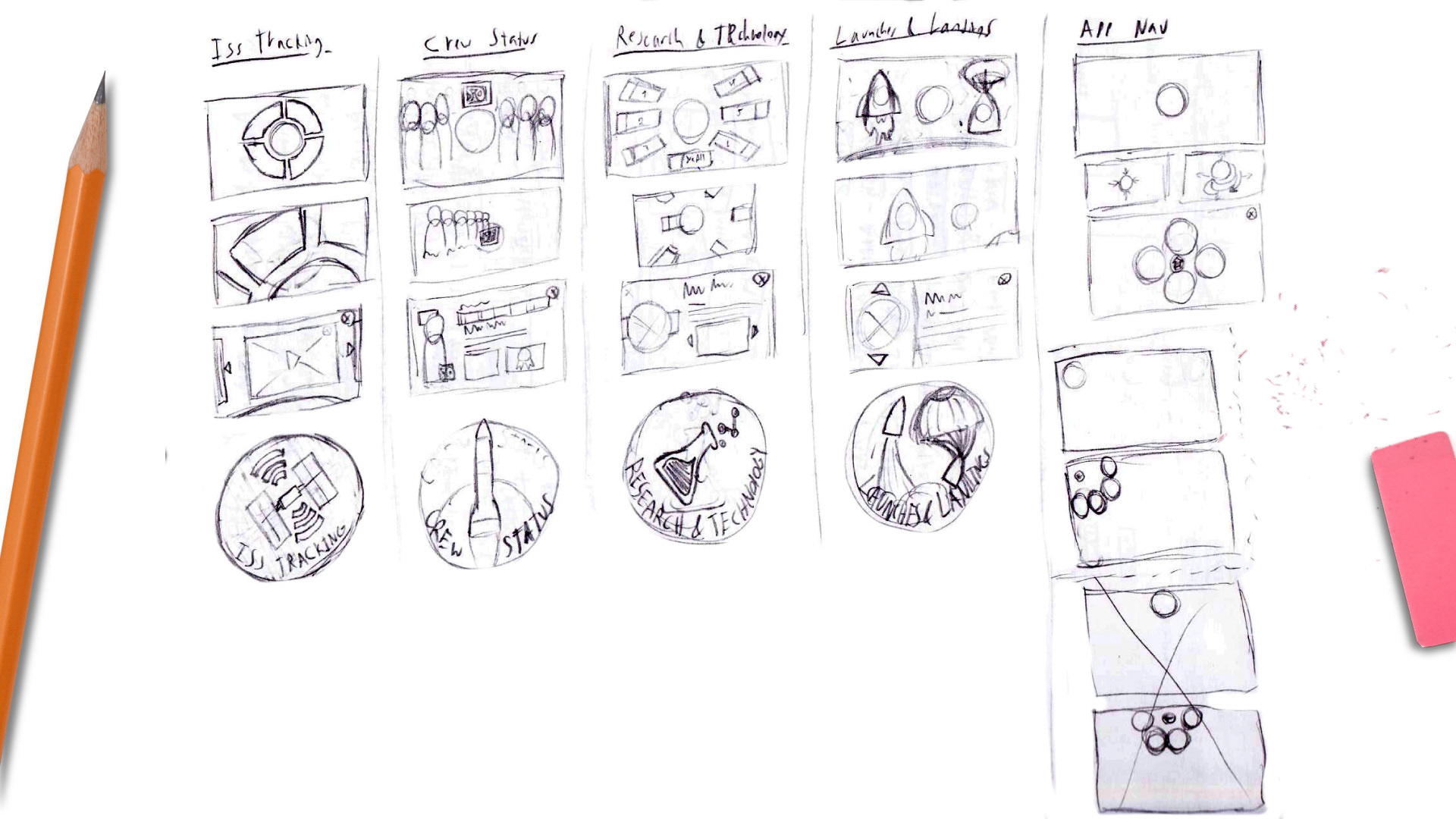
Since I had trouble choosing this project, These sketches came in midway through the project, a rough layout of a badge based UI, where each page would be symbolized by a space like badge you would see from NASA.
Wireframe/Composition
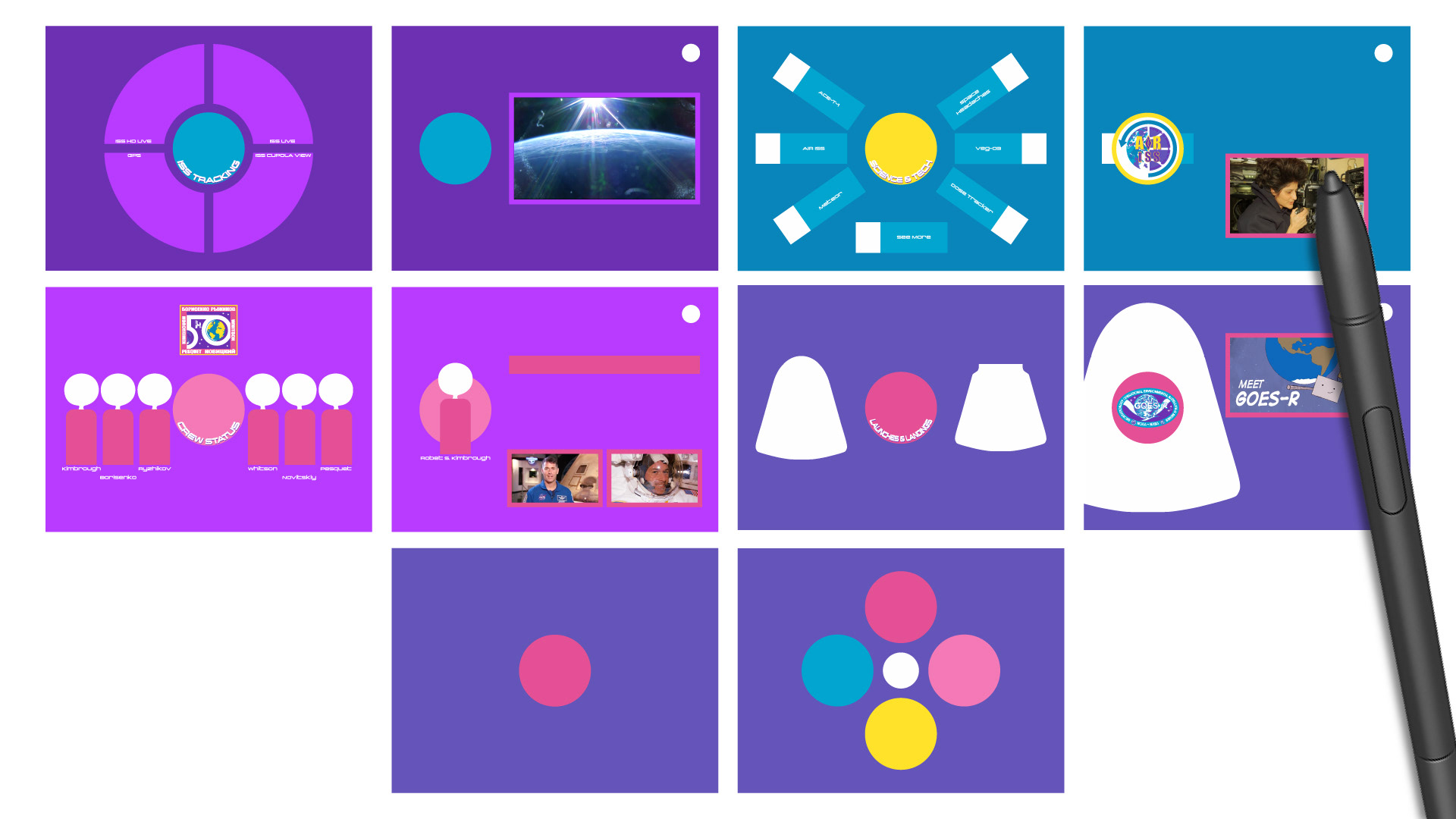
Here was the original Idea for the app I made, it is a very rough comp due to how late I was in the project, the deadline was coming up, and I needed to get my gears cranking to get this project out the door in a state I'm happy with. My main thing I wanted to show off from this com was theming. It is much more playful, because I moved from VR to iPad, target audience changed from my age to Mothers and Children. I went this direction because it had more character. This app was to connect the broken families. Main issue though was the UI was too abstract, so I had to update the design to mesh with more conventional UI while still keeping the thematic charm.
Final Comps