Smiles Per Hour
Spring 2017
Physical Installation
Smiles Per Hour is a happiness experiment, where my team and I set up kiosks around RIT's campus for a month and collected students happiness levels. We then displayed our data with a physical interactive installation at RIT's big event Imagine RIT. This project was my big final capstone team project for New Media Design at RIT. The team consisted of 2 developers: Dan Martin and Ben Cheng, and 4 designers: Kat De La Fuente, Casey Gilbert, Tim Torres, and me Meshach Galley.
We designed kiosks with five buttons with a range of faces from unhappy to really happy, and set them around 3 locations on RIT's campus. For the installation at Imagine, we built a servo controlled line graph made up of floating orbs. Users can go up to a touchscreen in front of the display and look at the timeline we collected from the happiness kiosks, the user can zoom in and out of the timeline, and pick which location they want to view as well.


This is the final version of the several pitch videos we made to tell what we were doing for our team project throughout the semester. The voices are from Kat and Casey, and from previous pitches, Casey's spot was covered by Tim. I even had a line in the oldest pitch.
I mainly did the editing for these videos, matching the audio with the visuals. And that sourt of became my big role in the team, doing editing and motion graphics work.
Stage 1: Happiness Kiosks
Conceptualizing

When we chose to focus on the subject of happiness across the RIT campus, we had to design a way to gather the data to get the levels of happiness. We discussed thousands of ideas on how to get this data, from digital ways like surveys, video communication, and NFC chip hot spots, to physical ways like sliders and thermal printers printing out physical sheets to show the users happiness.
In the end we felt these bigger ideas where to complicated and added unnecessary steps which will detour potential happiness submitties. So we went with a simple button interface.
Branding

With the combined efforts of Kat and I, we worked together to create the brand for Smiles Per Hour. Starting with the logo, of which is my design. It is a smiley face on a stop watch. Designed that way because Smiles per Hour. The Color scheme we landed on was Kat's contribution, using an colorful yet exotic color scheme, embracing the fun and happiness in our project, yet it is kept clean and simple with a white background to keep the design light on the eyes and increasing the impact of the brand colors.
The face is a smile, and hours are seen on watches. The Face used in the branding are later built upon designing the buttons for our kiosk.
The Smile Buttons
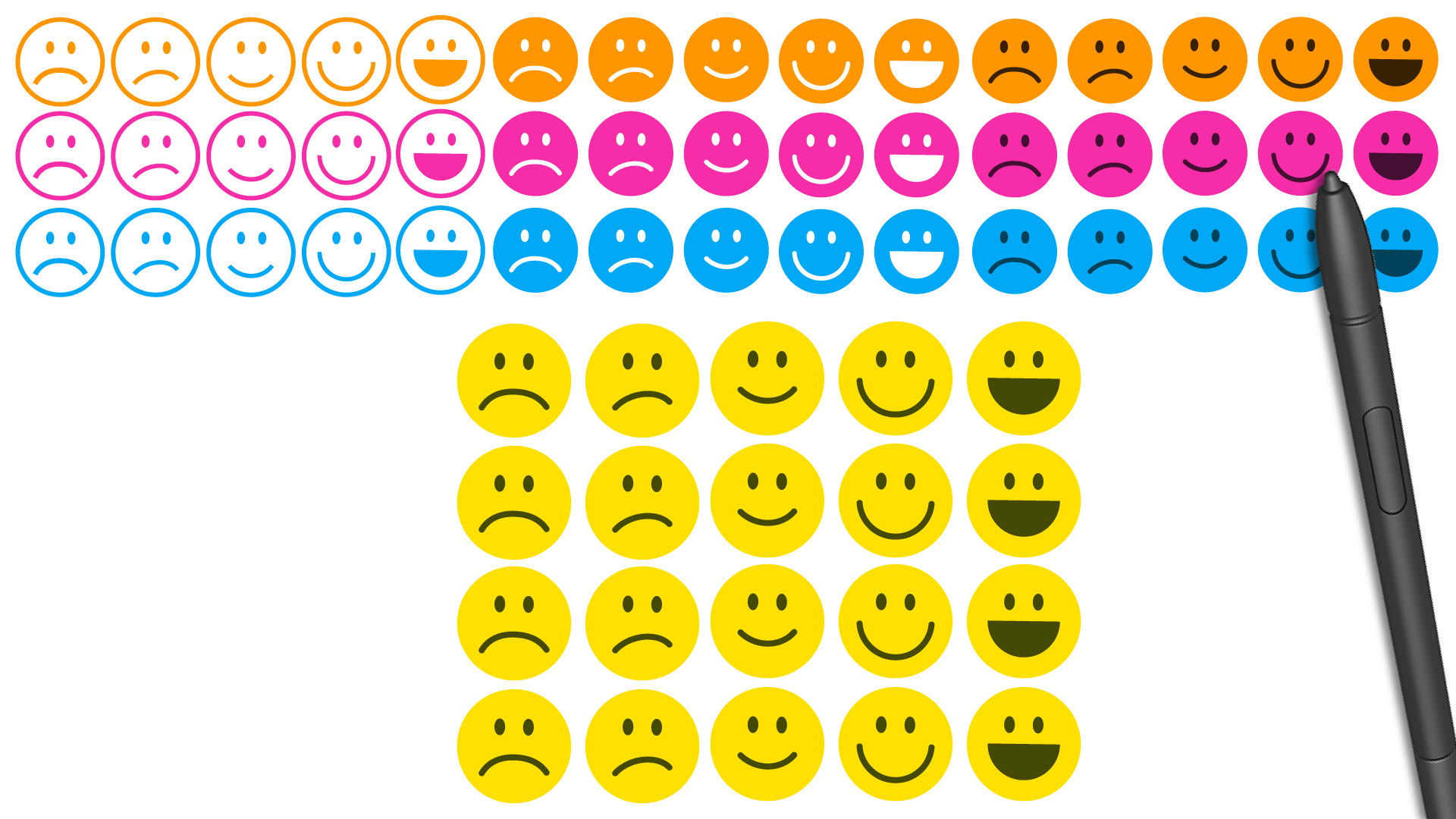
When we chose the button direction we then needed to design the buttons to indicate levels of happiness. We played around with several aesthetics and what faces should be made. We choose a classic yellow face design for the buttons to help users quickly recognize the faces and relate them to things like emojis, which are made for quickly personifying emotions.
The keen eye might also notice we lack a neutral face. This was fully intentional, because neutral is a default state, and we wanted people to really think about how they feel. By removing the neutral face, the user is left to ponder how they really are feeling rather than instantly taking the easy way out down the middle of the road.
Designing the Kiosk
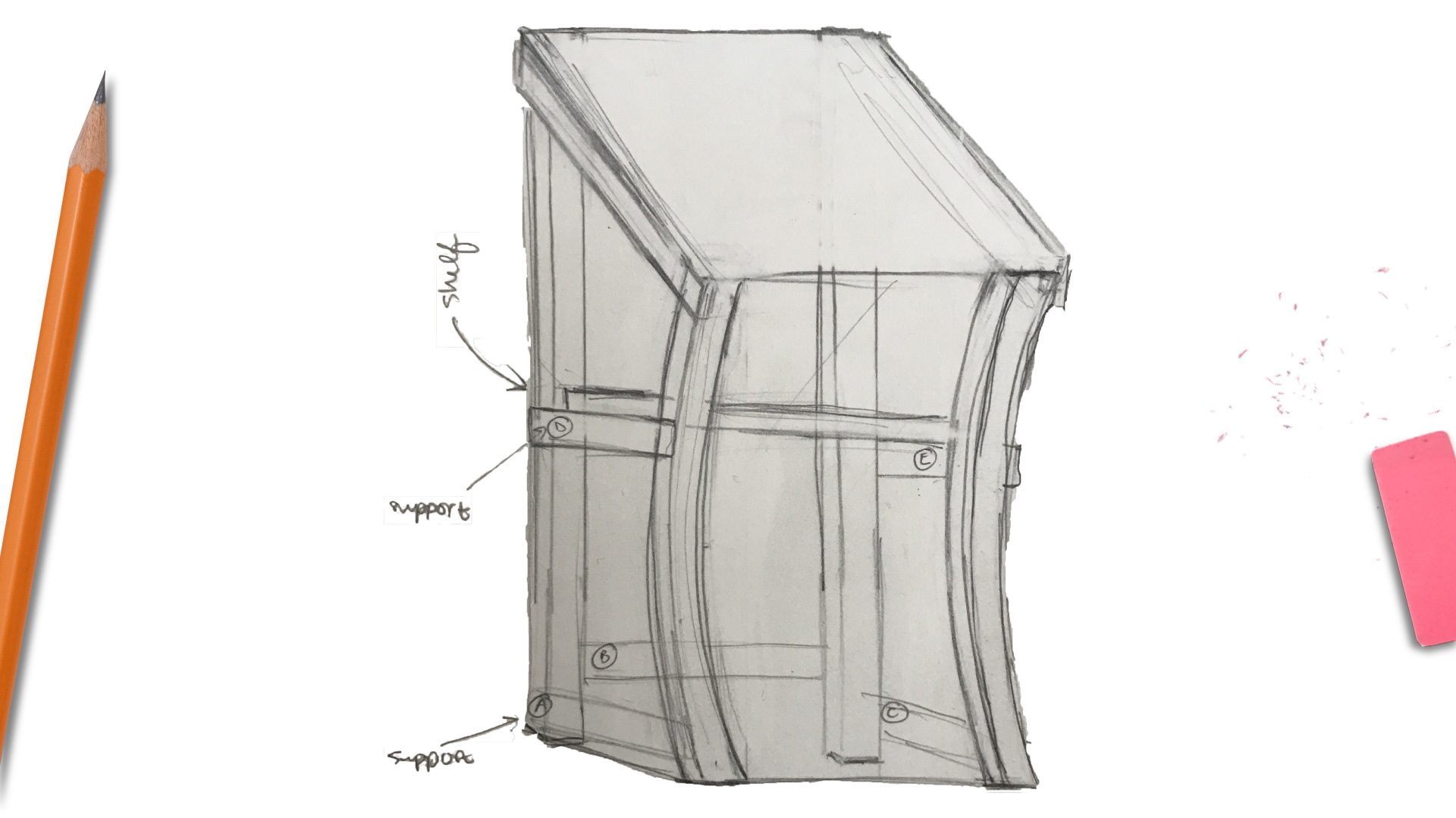
We thought about many ways to build a spot for users to input their happiness. From a wall mounted display to outdoor displays. We decided to go with the kiosk, A small ground display that is easily movable and maintainable.
We went with a curved design for the kiosk to give it the clean yet fun aesthetic our project has.
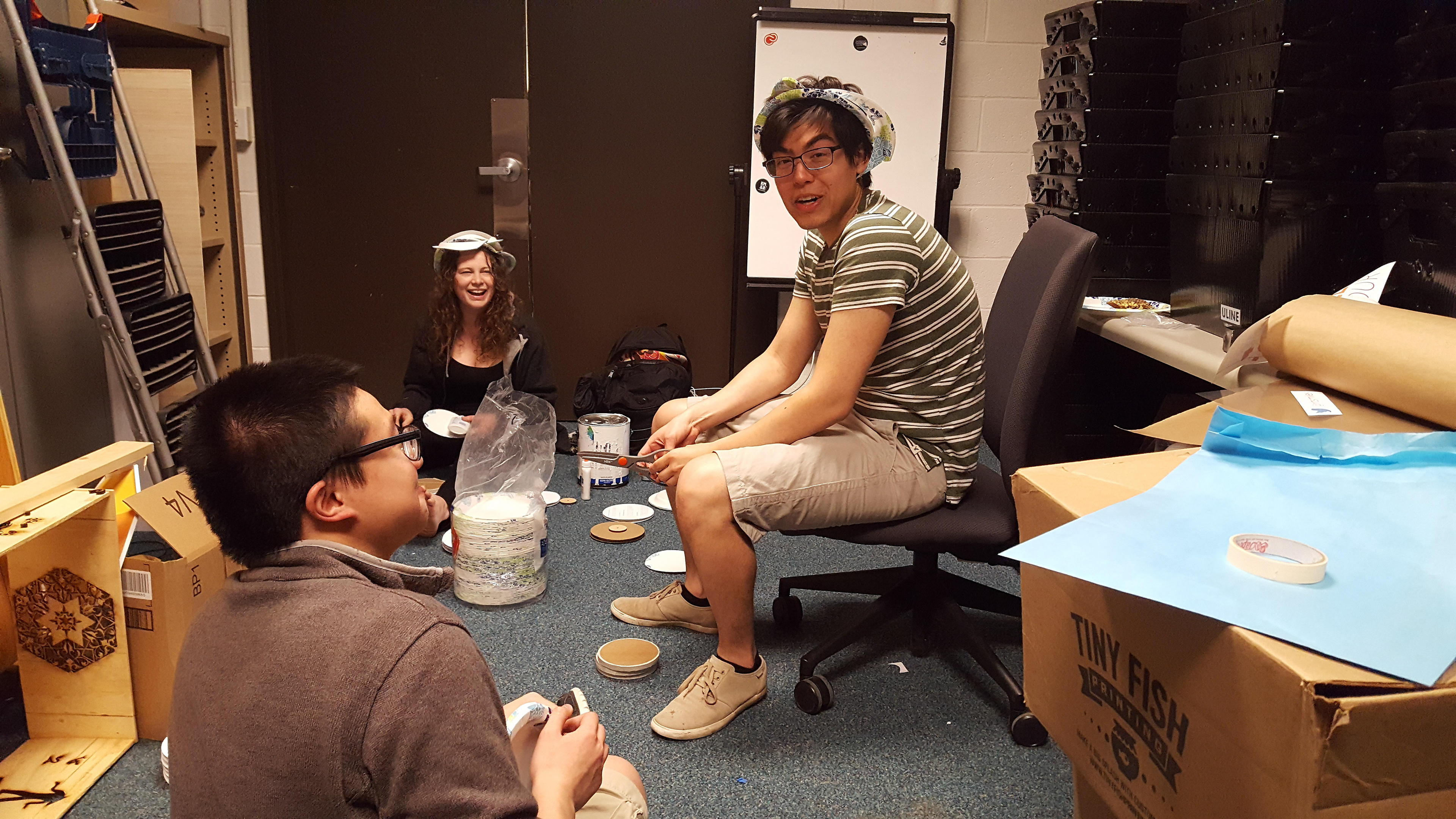
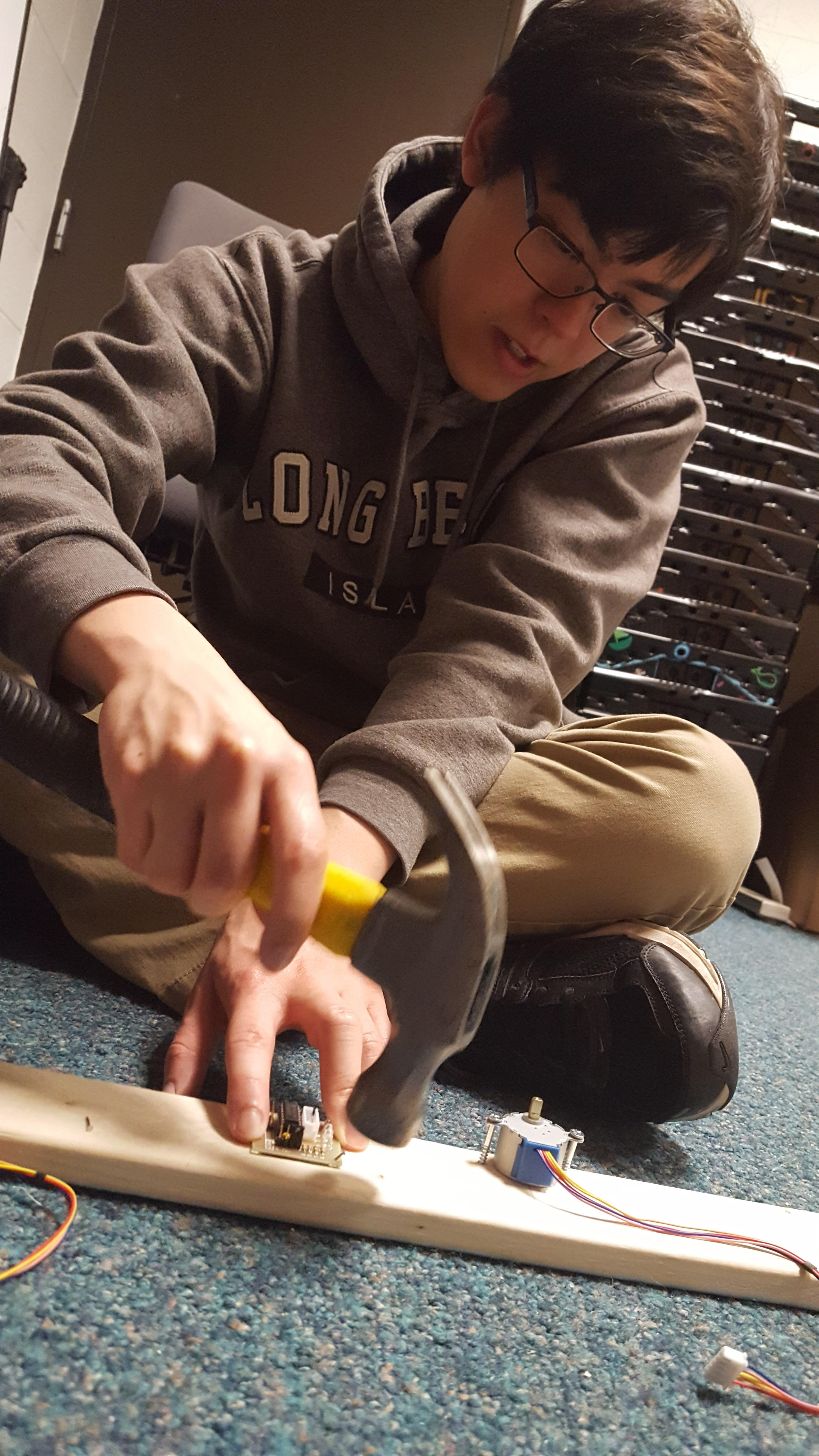
Building the Kiosk


With the help of our fellow team member Casey Gilbert's father, John Gilbert, we were able to hand craft our own unique happiness kiosks. Built out of wood, as a cheap, light, and sturdy material.
We painted the kiosks white, and we accented the kiosk with the main colors of our brand, indicating the different locations the kiosks would be placed.
Collecting the Data
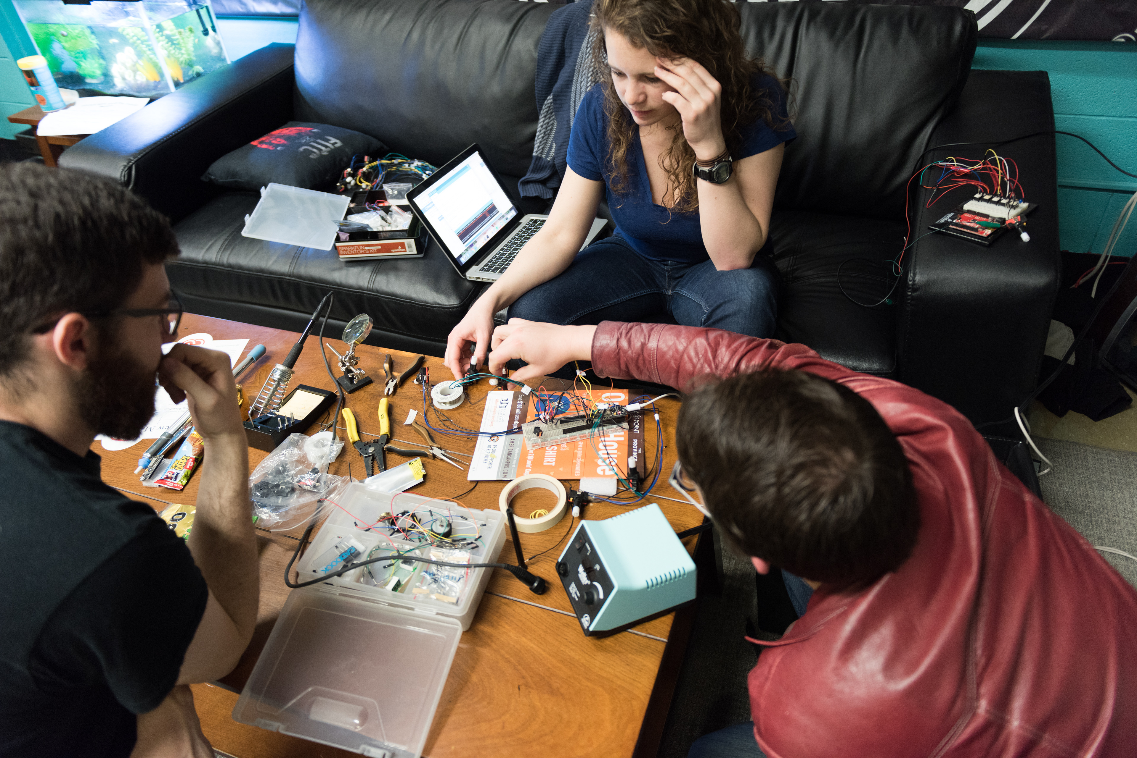
Thanks to the work of Casey and Tim, the kiosks used arduinos with wi-fi shields to send the data collected to a server. That data Is what we use to power our display for Imagine RIT.
When we got the kiosks out around campus they were a surprisingly ginormous success, throughout the month we received around 22255 hits. With user feedback popping up over facebook, instagram,reddit, and mostly twitter.
Stage 2: The Imagine Display
A Physical Display
This idea came up in the beginning when we were discussing what we wanted to do for our capstone project. We discussed many thins from Digital displays to VR, but our teammate Tim stepped in with the idea for a physical display.
We ended up sticking with the physical display idea because it would catch peoples eyes, we will learn new things, such as using arduinos to make the physical display, using VR is not ideal for Imagine RIT, for it will create huge lines and cause users to wait to use our project and further turn off potential visitors to our Imagine Display,and it is is uncommon for New Media projects being a actually physical object.
Building The Display


Designing the User Interface

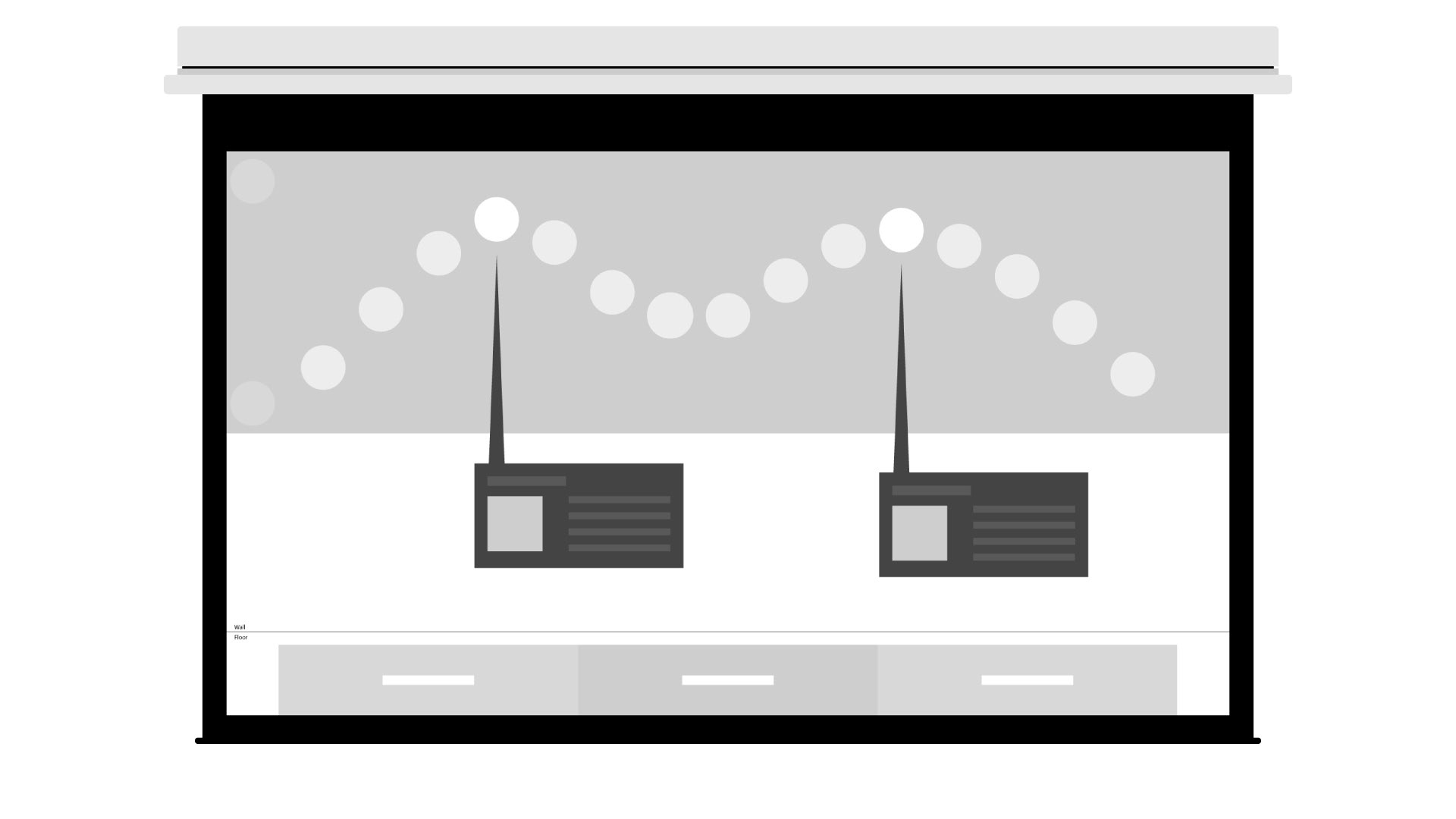
Kat and I focused on designing the UI for this display as Casey and Tim built the display. Kat focused on designing the Touchscreen for users to interact with, and I designed the projection interface the users saw alongside the physical display. We receptively collaborated together and played with each others designs to make them both collaborative efforts.
Final Designs
Promotion for Imagine RIT
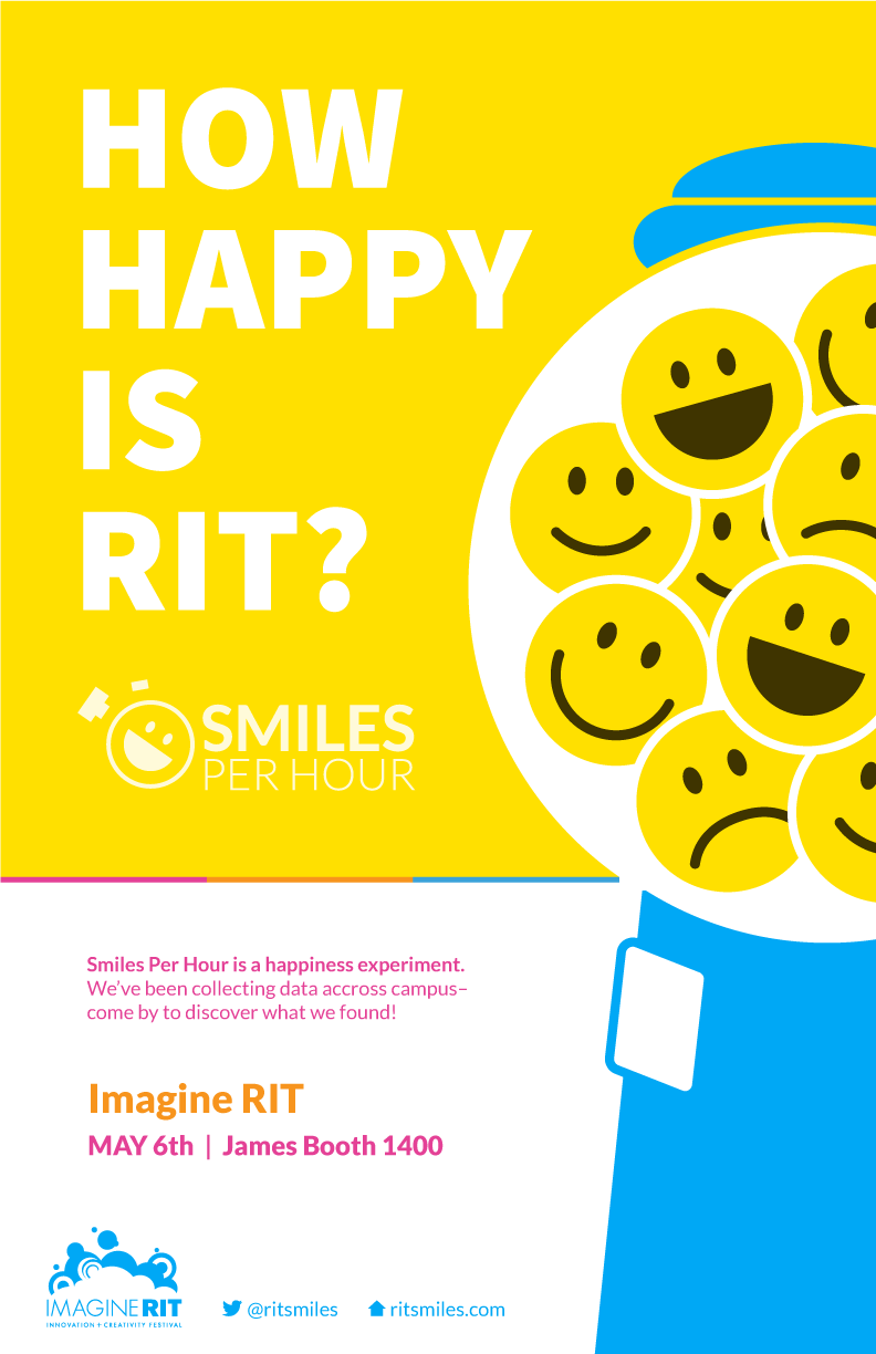
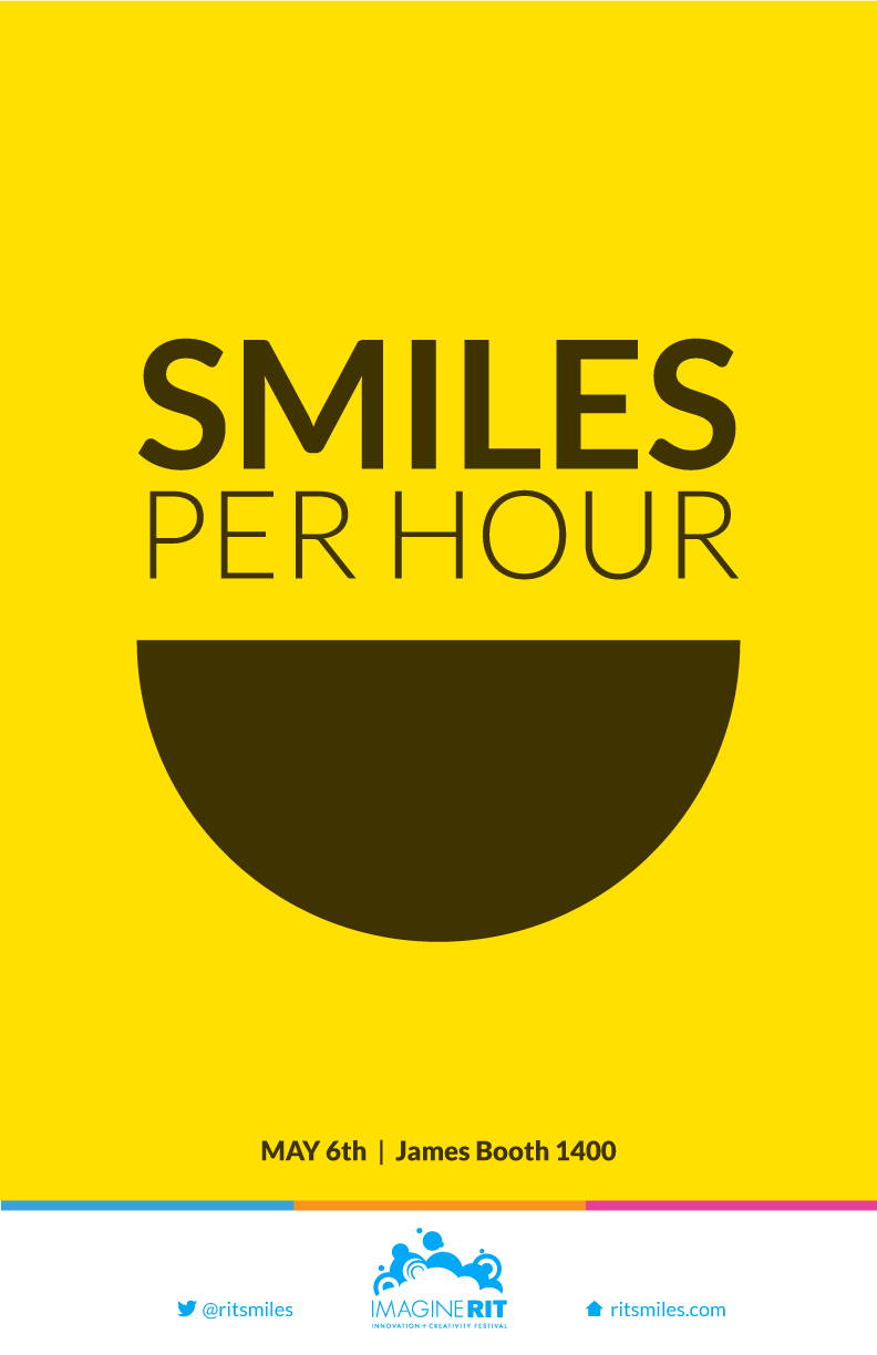
Kat and I played ping pong with some concepts for posters to advertise out project for Imagine RIT.
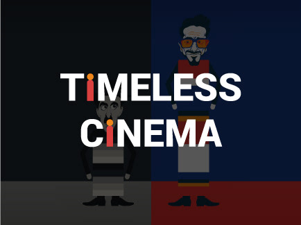
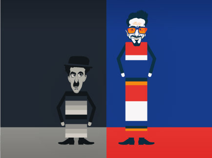
The final posters are each a collaborative effort but the main concepts were mainly from our individual ideas. There was the Capsule Machine design by Kat, and the Movie Poster design by Me. We used both in promoting Imagine, but Built off the Movie Poster design for displaying at Imagine.
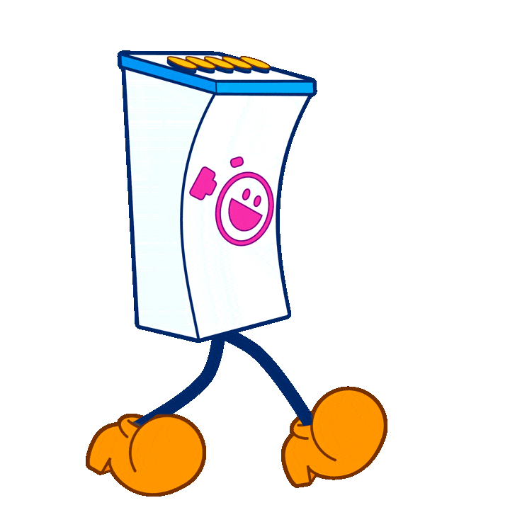
Kat also printed out stickers of the logo and of our internal mascot Kiosk Man. Both designed by me.
Imagine RIT